Hello everyone,
One important part of the web developer’s job nowadays is assure the responsiveness of the pages that he is creating. It is impossible to start a project which responsivity analysis is not a mandatory requirement, the therm Mobile First is a topic that every software developer should be comfortable a exhausted discussed here and here by instance. But even responsive development being not exactly a new trend, responsiveness test still being a challenging task once is impossible for a developer (even for a company) to have all devices to perform his tests and simulate specific scenarios for each case. In this article I’ll show the tools I normally use (does not mean that these are the best, just that I am familiar with). In my opinion, the most important factor to decide a tool amongst others is how much productive you are with it, in my case includes avoid repetitive work, prevents you wasting too much time to find their resources and to understand how it works and obviously, give a decent emulation of the device you’re aiming to.
I classified the tools in two sections, first those that you can use during the development time, that is, tools embedded in browsers toward get a notion of your design while it is being created, the second part consists of tools to check the overall result of your work after it has been deployed. Things like layouts, font-sizes, distances and menus are extremely sensibles for differents environments so it is really worth to exhaustly test them all in at least the most common environments.
During Implementation
Major moderns browsers have their ours developer tools. Although it is a embedded feature, they are highly mature with all that is needed to develop a page fully responsive together with Media Queries which you can emulate different types of screen. Personally, I use Google Chrome for development because I use some of his features such as CPU Profile, Network analysis and memory leaks (if you are not familiar with those resources in Chrome, attend the free course Discover DevTools). However, the Safari and Firefox version will be described here. Let’s see each one at a glance:
Google Chrome
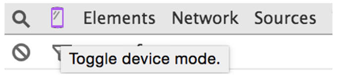
It is very easy to emulate a device in Google Chrome, first all open the ‘Developer Tools’ in View -> Developer -> Developer Tools then you will notice a cell phone image in the upper left side of the tool bar as you can see in the image below
After clicking on the device icon, the page turns to a mobile mode where you can select the device model to emulate specific scenarios and both rotation to portrair or landscape. One nice feature in Chrome is the simulation of network velocity, if data transfer is a potential threat and the page content large images or resources, the user can select a network connection in the upper tab.
Mozilla Firefox
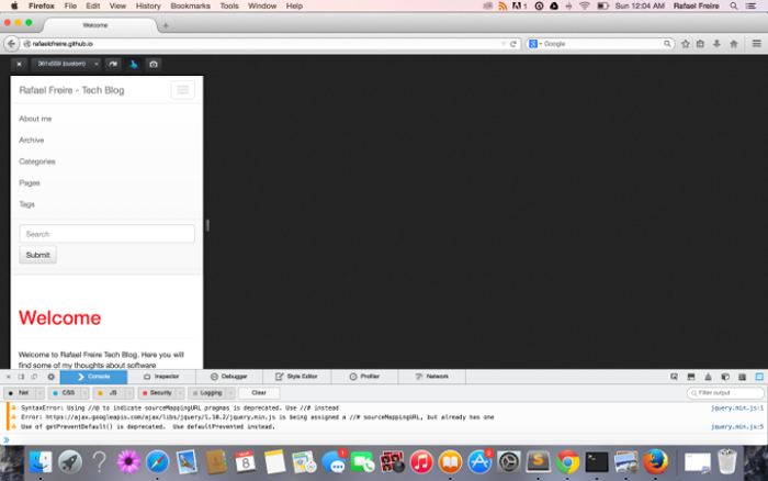
Mozilla Firefox uses a different approach, instead od choosing a target device you can enter the width and length sizes. To enable, just select Responsive Design View in ‘Developer Tools’(⌘⌥M in Mac). The useful controls to rotate and simulate touch events are above the rendered page as you can se below.
After Deployment
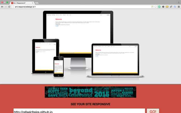
The ‘After Deployment’ tools are important for the overall look, to catch specific details that are hard to be tracked during development stage. Those pages are useful to test the navigation in different environments. They are called ‘after deployment’ because you cannot just point to your localhost. I like two sites that provides excellent simulation services, the first is Am I Responsive, an easy tool that permits you to see the rendered page in all devices at the same time. Unfortunatelly, it just renders in Apple viewports.
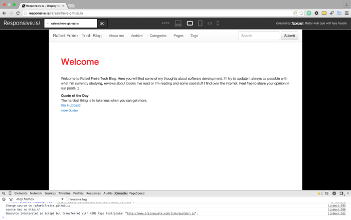
The other page I usually test my features is Responsive Is, which you can emulate different pre-defined viewports.
Further Reading
Recently I received a real good resource explaining the pros of using responsive design with two detailed posts. One called Responsive Design: Getting It Right with a nice infographic and other post called Keeping it Simple with Responsive Web Design, both with useful informations for those who are in doubt if worth to spend some time dedicated to ensure the responsiveness of his pages.
If you use another resource to test the responsiveness of your pages, write down on our comments.